
Redesigning Zoopla's Iconography
We see icons everywhere. Every day.
They help us find our ways around cities, airports and train stations. They allow us to better understand physical products and drive the way we use them. Icons also help us navigate complex software interfaces by supporting content, driving calls to action and providing clarity within workflows.
Created to easily communicate concepts at a glance, icons are meant to help lower cognitive load, provide clarity and drive behaviours.
As part of the Zoopla rebranding project, we decided to bring the current iconography in line with the brand and set its place within the Zoopla Design System.
The goal of the project was to define our use of icons across Zoopla’s product interfaces and ensure they support a clear and consistent user experience.
Setting a plain perspective
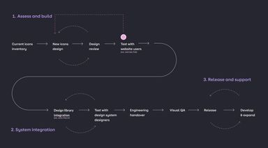
We treated this project like any other product design initiative. We started with defining a clear end-to-end roadmap covering the build of the icons library, its integration within the design system and a plan for release and support.
1. Assess and build
Starting with an icons inventory, we then moved to an incremental build and review approach. Once the base of the new language was in place, we ran a user testing session with external users in order to better understand the levels in which our icons are recognised and visually accessible at their desired sizes.
We tested our icons in 2 ways:
- standalone, to validate on accessibility and recognition levels
- integrated within real user interface (UI) as part of real flows, so we could understand user engagement in the desired environment.
2. Design system integration
Once the icons were ready to be integrated within our Figma library, we ran a beta release to the whole of the Zoopla design team. The aim was to find any naming or discoverability issues and also gain some feedback on the overall design approach. The engineering handover was followed by a visual quality assurance (QA) where we made sure the coded icons matched our visual design and accessibility standards.
3. Release and support
Once released, the icons library is constantly being supported by the design system team. We have put in place an icon request process that is integrated in our Design system ticketing platform. Once an icon is requested, a clear build process is followed, starting with the drawing stage all the way to the system integration stage.
This approach allowed us to carefully organise the whole process and gain much needed alignment between product, design and engineering around requirements, timelines and deliverables.
Building around principles
We wanted to design the new iconography language with a focus on simplicity and consistency. Simplicity was driven by the use of basic shapes, carefully combined in order to highlight just essential graphic characteristics. Consistency was set by following clear rules around object proportions, line lengths, angles and strokes, border radius and element spacings.
To make sure our desired direction was clearly highlighted and later communicated within our design team, we came up with 3 core design principles aiming to sit at the base of our approach.
1. Form follows function
The best icons are easy to understand and memorable. In our approach we prioritise functionality against complex looks.
2. Simplicity
Using a minimalistic design approach led by the combination of basic geometric shapes will reduce cognitive load and support a clear, accessible and easy to understand visual language. A monochromatic palette adds to the simplicity of the language and supports a smooth integration within the Zoopla brand.
3. Consistency and precision
Our design language is driven forward by a clear guidance around using grids, sizing, spacing, weights and proportions. Crafted with precision to a high level of detail our icons will be consistent and follow accessibility guidelines, both visually and in code.
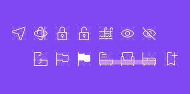
Introducing the Zoopla iconography design language
The icon grids and sizing
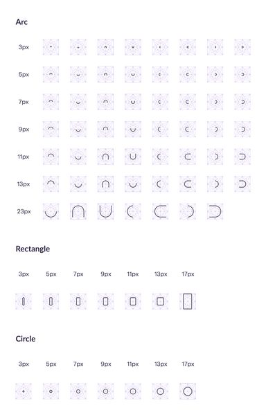
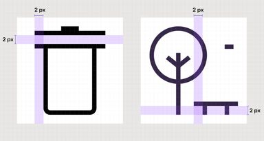
As the base of all our icons we have used the pixel grid. This allowed the alignment of every element to this grid, providing pixel perfection and ultimately sharpness on every device. But we went further and added what we call a diamond grid on top of the pixel grid. This helped us to set a language around line angles and overall element proportions.
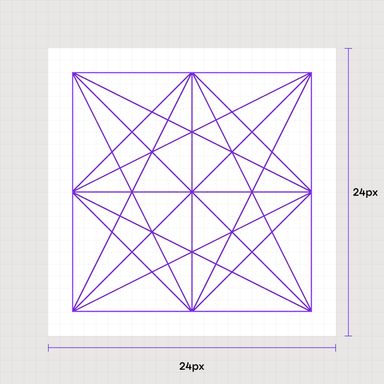
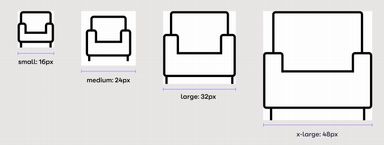
The target size for our icons is 24px, and we are also drawing everything for 32px, 48px and also 16 px. The consistency of the level of detail is kept from 24px to 48px. In some cases, the16px icons will display less details than the ones drawn on larger sizes.
Icon building blocks
At the base of our icons design language stands a system of basic shapes that are used as building blocks when drawing a new icon. We have built this system with the aim of supporting designers in the icon drawing process and ensuring that any newly drawn icon follows our guidelines around visual style and element proportions.
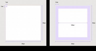
As in any other system, this area is an essential part of the foundation so the majority of the rules around our icons' visual style is defined at this level. We have clear rules around line strokes (set to 1px) while any circle or rectangle has to have a certain size in order to follow our proportions guidelines.

Defining icon states
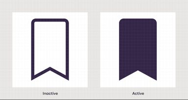
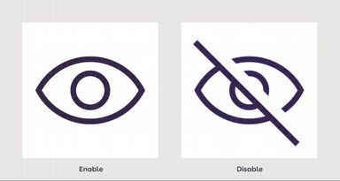
During the design process, we have carefully considered that in some cases, our icons can indicate different states of certain actions (e.g. on / off, active / inactive). This has led to defining a clear set of visual rules around different use cases of an icon. For example, when we are treating an active / inactive state, the active state will always show a filled icon. In contrast, the difference between enable / disable states is marked by a 45 degree line that goes across an icon.
Accessibility
From a purely visual standpoint, the sharpness of each element that is part of an icon had to be considered in order to make sure that every symbol is easily recognised on any size or screen density. To address this we have set a minimum element spacing area of 2 px, and we made sure that the majority of our shapes are pixel perfect. At code level our engineers are using the ARIA principles in order to communicate the roles, states and properties of our icons.
As the icons are monochrome, the choice of colour has been driven by a contrast ratio in line with the AAA accessibility standards. Having icons available on different sizes will also allow designers to target specific devices and user requirements.
In code, our icons appear as svgs. This allows engineers to easily change their base colour by using our design tokens system. Text labels are also added to each icon in order for the screen readers to correctly recognise them.
Integration with the brand
The Zoopla iconography guide comes as a supportive component for the Zoopla brand. We are aiming for a clear connection between our icons and any other visual artefacts that are used across our products.
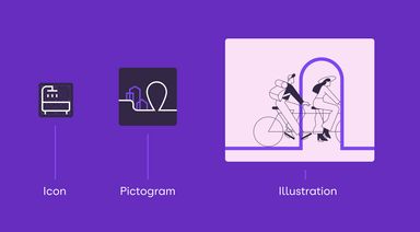
The leading line concept is precisely carried across, from the icon level all the way to more complex illustrations.
Adoption and evolution
Having a library of icons sitting on a folder doesn’t add any value to our products so a key milestone of the project was the adoption strategy. This was a crucial part of our release phase and we wanted to make sure everyone is in line with the guidelines and the contribution process. We have two types of users of the library: On one side we have the designers, who can also be contributors, on another side we have the engineers, who are the ones implementing the icons in the code. They are different entities and present different needs. Below are some examples:
Examples of designer needs:
- How do I use the icons in Figma?
- How do I search for an icon?
- What if an icon does not exist?
- How do I draw my own icons?
- Where do I get support?
Examples of engineering needs:
- What should be the format of the icons in code?
- Where can I find a required icon?
- Do we have any specific tokens for icons?
In order to address the designers needs, we have created a simple guide that has been shared across the organisation via our design hub. It covers core information regarding the usage and drawing guidelines for new icons. Designers can also reach out for support via our dedicated Slack channel.
In order to standardise the engineering handover, we started using a plugin that helps us export all the icons from Figma to an SVG file that can then be used in Storybook. This way the engineers know exactly where to find any asset and its related documentation.
Conclusions?
Iconography is a core part of any brand and having a unique approach to it will help elevate it against the competition. It is constantly evolving with the brand and alongside all the heavy lifting that goes into the craft, it is driven by a strong systematic thinking, research and user feedback.
Its purpose is to help our users navigate with ease within our products by quickly conveying essential information at specific times.
Setting clear principles around the way the icons will be built has helped us achieve a high-standard level of work that is in line with the bar set by the Zoopla Rebrand.